A little more than five years ago, major search engines like Google began prioritizing the mobile versions of websites (as opposed to desktop versions) in their indexing efforts. This progressed to the point where mobile versions became the primary versions that search engines indexed as of last fall. Recently, Google brought this concept of mobile-first indexing full circle by stating that it would no longer index websites that were not functional on mobile devices. The rationale for these developments is obviously rooted in consumer behavior.
These days, most website owners, marketers, and digital professionals have a foundational understanding of mobile-friendliness and responsive design. If your website looks bad when loaded on a small screen, you have a problem. However, many of these people struggle to move past the subjectivity of the mobile-friendliness discussion into something objective and quantifiable. This is where the concept of Core Web Vitals becomes relevant.
Understanding Core Web Vitals
Core Web Vitals are a set of metrics Google developed to measure the most meaningful dimensions of mobile-friendliness. By encouraging website owners to strive to improve these metrics, the internet becomes more user-friendly and navigable from a smartphone.
Core Web Vitals include three main metrics: Largest Contentful Paint (LCP), Interaction to Next Paint (INP), and Cumulative Layout Shift (CLS). There is an abundance of content explaining these metrics in depth online, but the important thing to know is that LCP and INP measure speed, whereas CLS measures visual stability. For mobile sites, these metrics show how quickly a page loads on a smartphone and whether it visually changes when loaded. Slow websites, as well as ones that visually change as someone is browsing, tend to offer poor user experiences.
Using PageSpeed Insights
Google’s PageSpeed Insights tool lets you calculate Core Web Vitals for any webpage for free. Let’s take a look at an example using the website of a popular drinkware and cooler brand, Yeti.
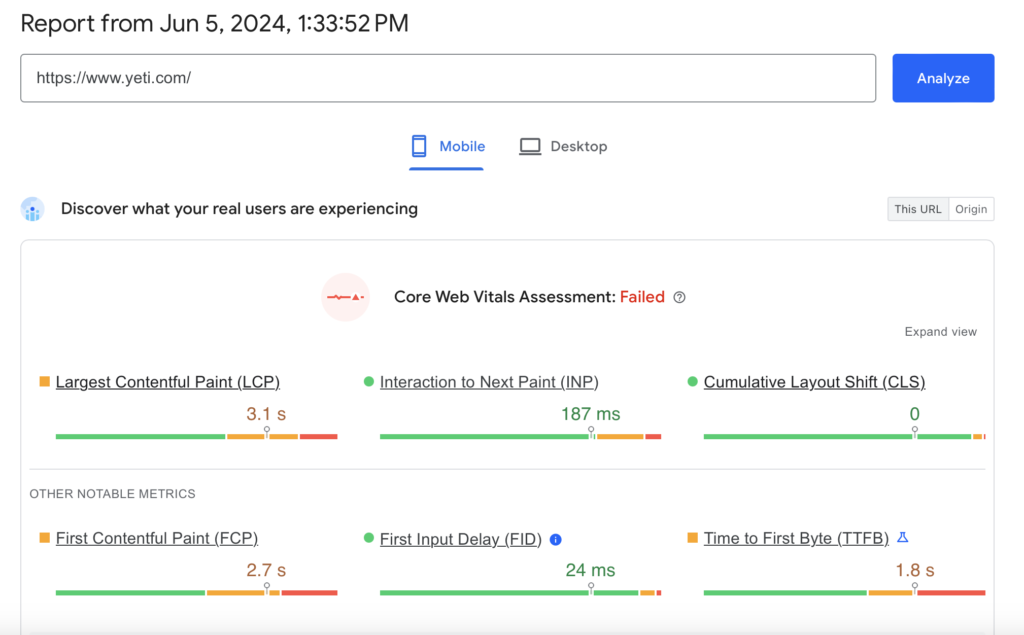
As you can see from the screenshot, Yeti’s homepage passes the INP and CLS tests, but its LCP is slightly slower than what Google deems optimal. Saying the site fails is probably harsh, but there are improvement opportunities such as reducing image sizes and reconfiguring the way JavaScript loads.
Now, let’s take a look at the Core Web Vitals for the sweatshirts page of retailer Old Navy’s website.
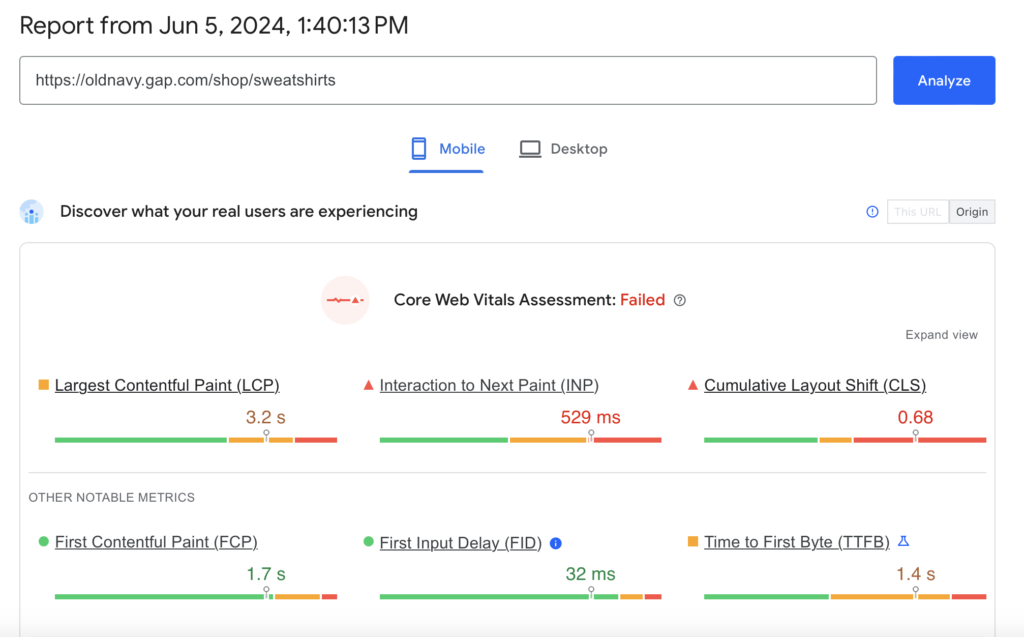
As we can see, the page struggles across the board with these metrics. I specifically want to point out that CLS is well outside an acceptable threshold. This means that when loaded on a mobile device, there are likely some disruptive shifts to the display of the page. These shifts could annoy or discourage potential customers from continuing their session or returning to make purchases in the future.
Conclusion
My hope is that you’re starting to connect the dots between the concept of mobile-first indexing and Core Web Vitals. It’s crucial to realize that mobile-friendliness isn’t purely subjective; there are a number of metrics that can be used to establish benchmarks and measure improvement over time.
As a key component of SEO success, mobile-friendliness should be a key component of your digital marketing strategy. If you’re interested in partnering with an agency that can help you improve your website’s performance on mobile devices, Riviea is here to help. Get in touch with us today to discuss how we can assist you.

0 Comments